Design
How to choose a microcement colour and texture
From soft whites to oxidised metals, how a microcement colour reads depends on light, texture and sheen. A practical guide to narrowing the choice.
Key takeaways
- Start with the room, its fixed materials and the mood you want, then narrow the choice to one or two collections.
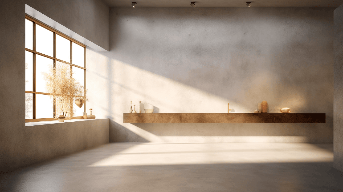
- Daylight direction, globe colour temperature and sheen all change how a microcement colour reads.
- Hand-trowelled microcement has natural variation, so clouding and movement are part of the finish rather than flaws.
- Screens are unreliable for colour: compare physical samples in the light of your own space before you commit.
Choosing a microcement colour is part colour decision, part texture decision. The same shade can look soft and chalky on a matte bedroom wall, then deeper and more reflective on a sealed kitchen floor. Knowing what changes a finish makes the choice far easier.
This guide walks through the seven Luxury Concrete collections, how light and sheen affect what you see, and how to test samples properly. Keep our colours and textures page open as you read to see each swatch.
Start with the room, not the swatch
A colour that looks perfect on its own can clash with the timber floor, stone benchtop or tapware it will sit beside. Before browsing, take stock of what is staying and how you want the room to feel: calm, warm, crisp or dramatic.
- Which surfaces will share the finish: walls, floors, benchtops, furniture or all of them?
- Which materials are staying, such as timber, stone, tiles or metal fixtures?
- How much daylight does the room get, and from which direction?
- Should the surface recede into the background or become the focus?
The seven microcement collections
Luxury Concrete colours are grouped into seven collections. The notes below describe the character of each one based on its swatches; a physical sample is always the final word.
Basic
A neutral scale from clean white to deep charcoal: Blanco, Panacotta, Alaska, Aluminium, Plomo, Gris Marengo and Graphite. The whites and light greys keep rooms bright and quiet, Gris Marengo is a softened mid grey and Graphite is a deep charcoal with a warm undertone. It is a versatile starting point for continuous floors and minimal interiors.
Warm
Earthy browns and sandy tones: Cacao, Camel, Centeno, Chocolate, Latte, Nogal and Ocre. The range runs from sand, soft apricot and blush beige through a greyed taupe to rich reddish and deep browns. Warm tones sit naturally beside timber and suit living areas and bedrooms that should feel enveloping.
Nordic
Pale, softened tints: Almond, Gris, Gris-liquen, Jengibre, Lino, Mocha, Nacar and Siena. Expect a creamy yellow, a pale grey, a lichen-like grey-green, soft ginger and peach tints, a linen-like off-white, a pale greige and a gentle blush. They keep a room light while adding more warmth or character than a plain white.
Live
Saturated, confident colour: Arcilla, Foresta, Indico, Kinoto, Lima, Turquesa and Valencia, covering terracotta clay, olive green, deep teal blue, warm orange, a muted yellow-green, soft aqua and a vivid orange-red. These suit feature walls, furniture, commercial interiors and small rooms where one strong colour can lead.
Oxid Metal
Metallic-effect finishes in Brass, Bronze, Copper and Heavy Iron, each shown with and without an oxidant. The plain versions read as olive gold, brown bronze, coppery red-brown and speckled dark iron, while the oxidant versions add an aged patina, from blue-green verdigris to rust-flecked iron. They are statement finishes, best on a feature wall, counter or piece of furniture.
Gemstone
Ambar, Carnelian, Diamond and Ruby show strong marbled movement, with darker veining over golden yellow, warm orange-tan, silvery white and coral red. Because the pattern is a large part of the look, view the biggest sample available and picture it across a whole wall.
Glowing
Mars, Star, Sun and Uranus have a speckled, textured surface that appears to catch the light in the swatches, in sandy peach, silver grey, golden brown and a dark charcoal with silvery flecks. As the name suggests, these are finishes to judge under your own lighting.
How light changes a microcement colour
Daylight and orientation
In Melbourne, as elsewhere in the southern hemisphere, north-facing rooms receive the most consistent, warm sun, while south-facing rooms get cooler, indirect light. East-facing spaces are brightest in the morning and west-facing ones catch strong, warm afternoon light. Cool light can make greys look bluer and whites flatter, while warm afternoon light pushes beiges and sands towards peach.
Artificial light temperature
Warm white globes, common in living areas and bedrooms, shift colours towards yellow and amber. Cool white or daylight globes, often used in kitchens, bathrooms and workplaces, make the same colour look crisper and greyer. Light that grazes a surface at a low angle, whether from late sun or a downlight close to a wall, also exaggerates texture and trowel marks.
Texture and sheen
Microcement can be finished from matte to glossy and from rough to smooth. Smoother finishes read as refined and even, while more textured finishes show the movement of the trowel and feel closer to natural stone. The sealer and final polish both influence the sheen.
- Matte: low reflection and a soft, chalky look that is forgiving of fingerprints and fine marks.
- Satin: a gentle sheen that lifts the colour slightly without strong reflections.
- Gloss: deeper, richer colour and more reflection, which also shows glare and fine scuffs more readily.
For floors in wet areas, texture and sheen also affect slip considerations, which should be confirmed for each project. Our bathroom renovation guide covers this in more detail.
Natural variation and trowel movement
Microcement is applied by hand in several layers, and each pass of the trowel leaves subtle tonal shifts. This clouding and movement is part of the character of the material, which means no two surfaces are identical. A sample shows a slice of that movement; a whole wall or floor shows it at full scale.

In the swatches, trowel movement is subtler in the palest colours and more visible in darker, stronger tones and in the metallic and gemstone finishes. If you prefer a quieter surface, start with lighter neutrals and a smoother texture. If you enjoy movement, the deeper and more decorative finishes will show more of it.
Room size, continuity and pairing
Room size and continuity
A seamless surface removes the visual breaks of grout and joints, which can help a room feel larger and more unified, and running one colour across floor and walls blurs the edges further. Pale colours reflect more light, while deep colours draw walls in and make a room feel more intimate. Carrying the same finish onto a vanity, bench or table, as described on our furniture applications page, gives a monolithic, built-in look.
Pairing with timber, stone and metal
Warm and Nordic tones sit comfortably beside oak and other pale timbers, while cool Basic greys create a crisper contrast with warm wood. With natural stone, pick a colour that echoes an undertone in its veining rather than competing with it. Brushed brass and bronze fittings suit warm microcement, black and chrome suit the Basic greys, and an Oxid Metal feature works best against quieter surfaces.
Why screen colours vary, and how to test samples
Every screen displays colour differently, and photographs are shaped by camera settings and the light in which they were taken. Treat online swatches, including those on this site, as a starting point only. The reliable test is a physical sample viewed where it will be installed.
- Shortlist two or three colours from one or two collections.
- Compare physical samples in the light of your own space.
- Hold samples vertically for walls and lay them flat for floors.
- Look at them in the morning, mid-afternoon and at night under your own globes.
- View them beside the materials that are staying, such as joinery, stone, timber and tapware.
- Ask how the chosen sealer and sheen will change the depth of colour.
When you are ready, contact us to talk through your project and your shortlist. If you are planning a feature wall, our feature wall applications page shows how colour and texture work at scale.
Frequently asked
01Can microcement be made in a custom colour?
Microcement can be customised in a wide variety of colours and finishes, and the seven collections are the best starting point. If you have a specific colour in mind, include a reference with your enquiry so we can talk through the closest options and how they are likely to look once sealed.
02Does sealing change the colour of microcement?
Sealing protects the surface and enhances the colour, so the finished result usually looks slightly richer than unsealed material. The sheen of the sealer also affects how deep the colour reads, which is why it helps to view samples with the intended finish.
03Which microcement colours suit small rooms?
Lighter colours from the Basic and Nordic collections reflect more light and help a small room feel open, especially when one finish runs across floor and walls. Deeper colours can also work well in a powder room or study, creating a cocooning feel, provided the lighting is planned with them.
04Will my finished surface match the sample exactly?
It will be close but not identical. Hand-trowelled microcement has natural variation in tone and movement, and a large surface shows more of that character than a small sample. Viewing the largest sample available, in your own light, gives the most realistic preview.
05Can walls and floors be different colours?
Yes. One colour across floors and walls gives the most continuity, while a contrasting floor or a single feature wall adds definition. If you choose more than one colour, plan where each one starts and stops, usually at a corner or another natural break.
Keep reading
Related guides.

What is microcement? A complete guide
A plain-English guide to microcement: what it is made of, how it compares with paint, render and polished concrete, where it works and where it does not.

Microcement for commercial interiors: cafés, salons, retail and offices
Seamless, durable and easy to clean, microcement suits cafés, salons, retail and offices. How to plan it around trading, other trades and cleaning.

Microcement glossary: 30 terms explained
From two-component systems to sheen and substrate humidity, a plain-English glossary of 30 microcement terms you are likely to hear when planning a project.